It's an on-going project with Ojisu homestay service. Ojisu used to be a homestay website that was used mainly by customers who received academic service from Ojisu's sister programs. Now Ojisu wants to be a platform facing all students who are seeking homestay in the U.S. The initial task was to reinvent the user flow and visual concept to engage more users to use the website and increase its conversion rate.
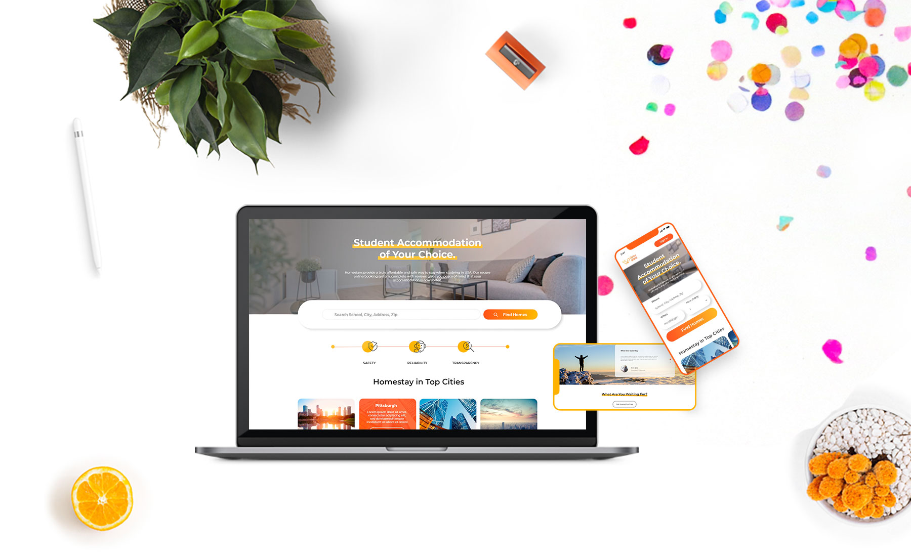
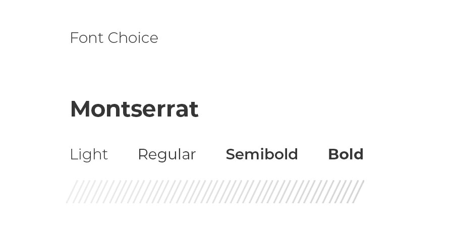
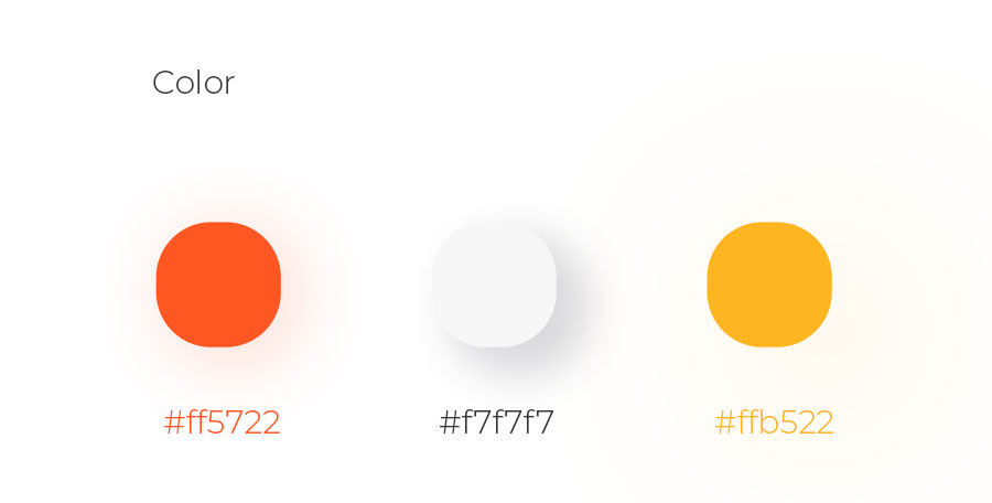
The initial website wasn't received much user attention. Only visiters with vailid profiles could see the listing details. To make the website used by all home seekers, function flow regarding to guests needs to be modified.
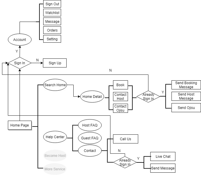
After developing the style guide and userflow I proceeded further to landing pages design and user cabinet UX.
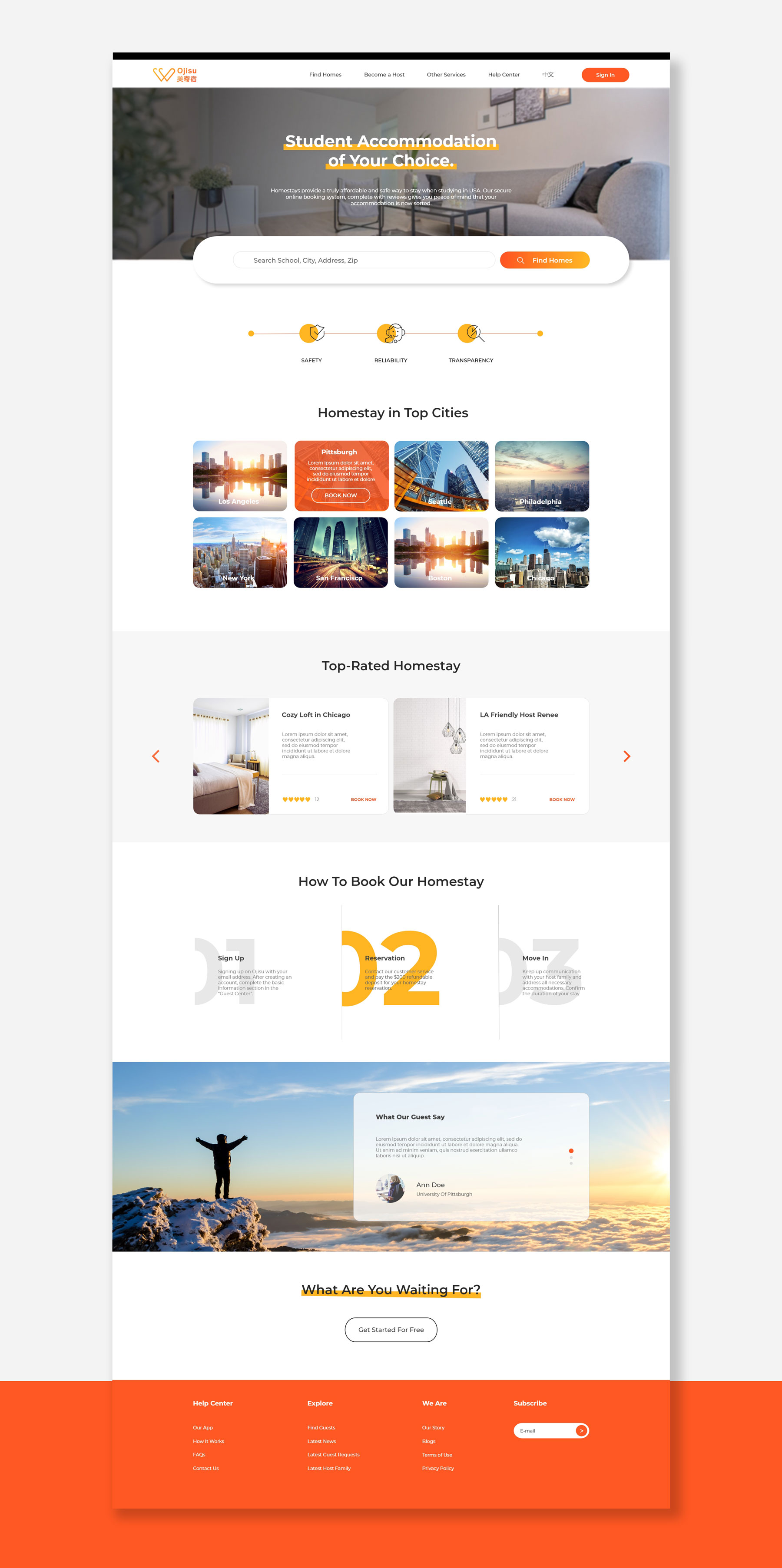
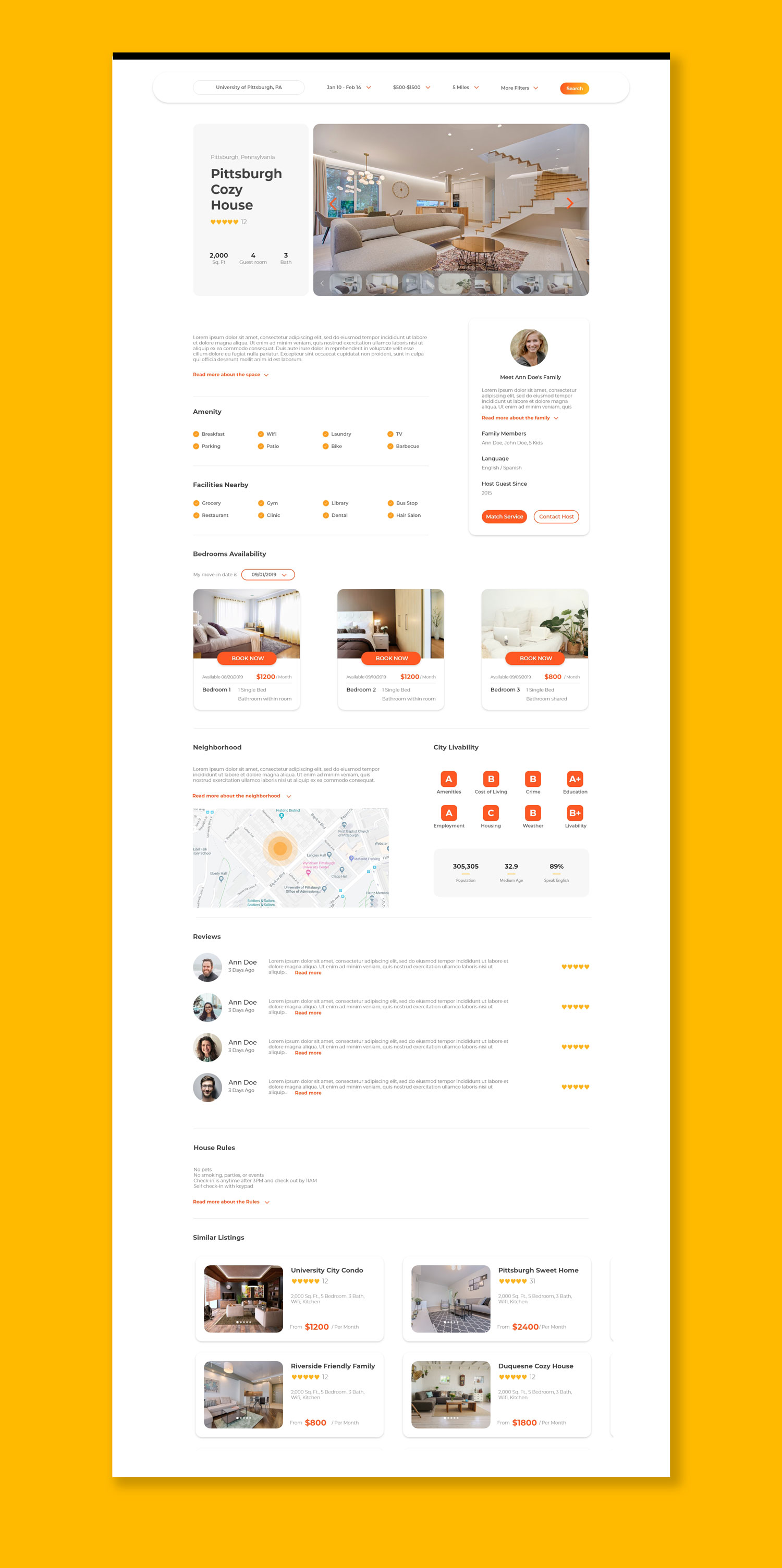
One of the most important tasks was to develop a clear listing detail page to engage users to book rooms directly with Ojisu service.
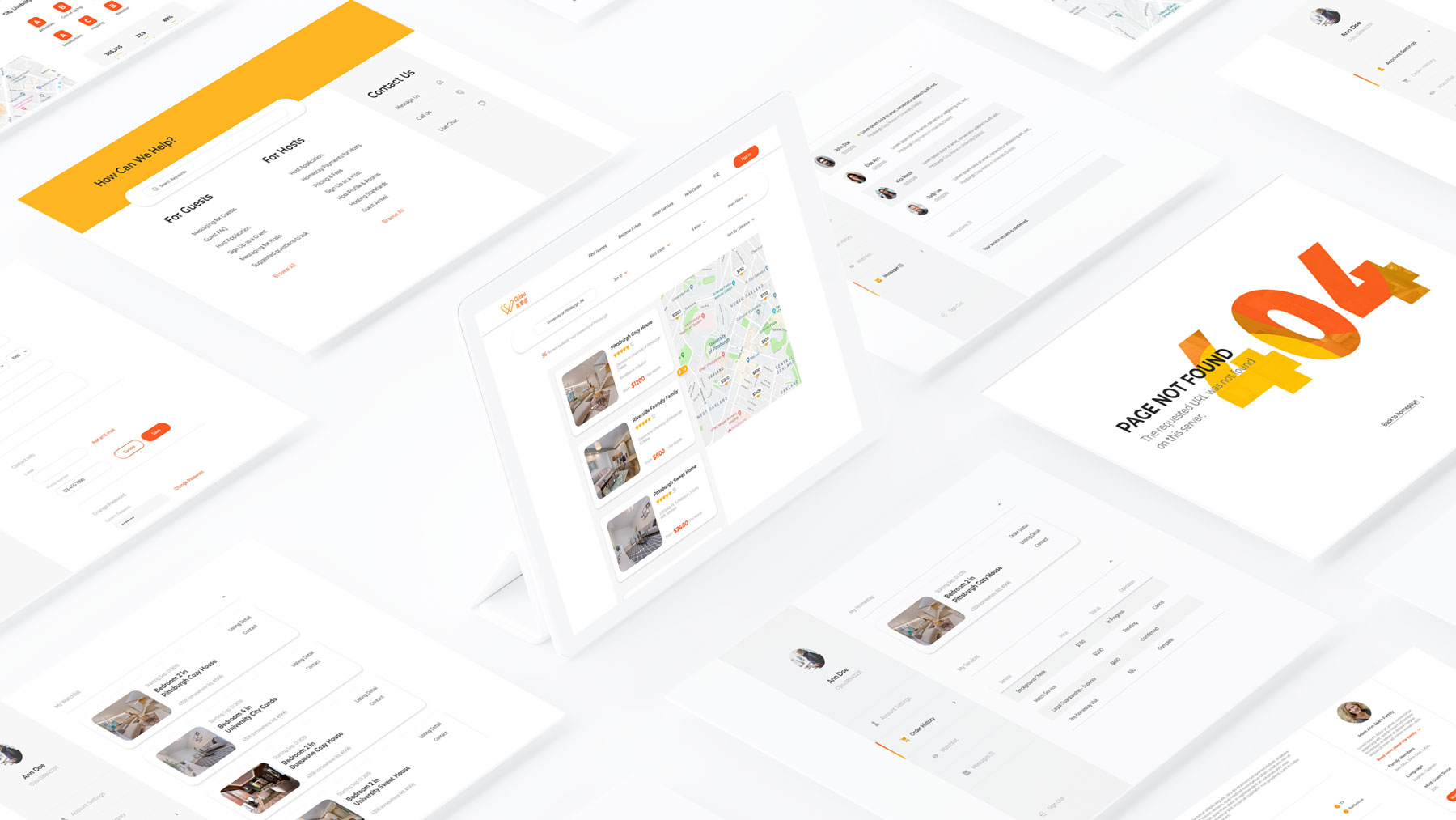
The reinvented user interface also includes home searching, account setting, messaging, watchlist, etc.
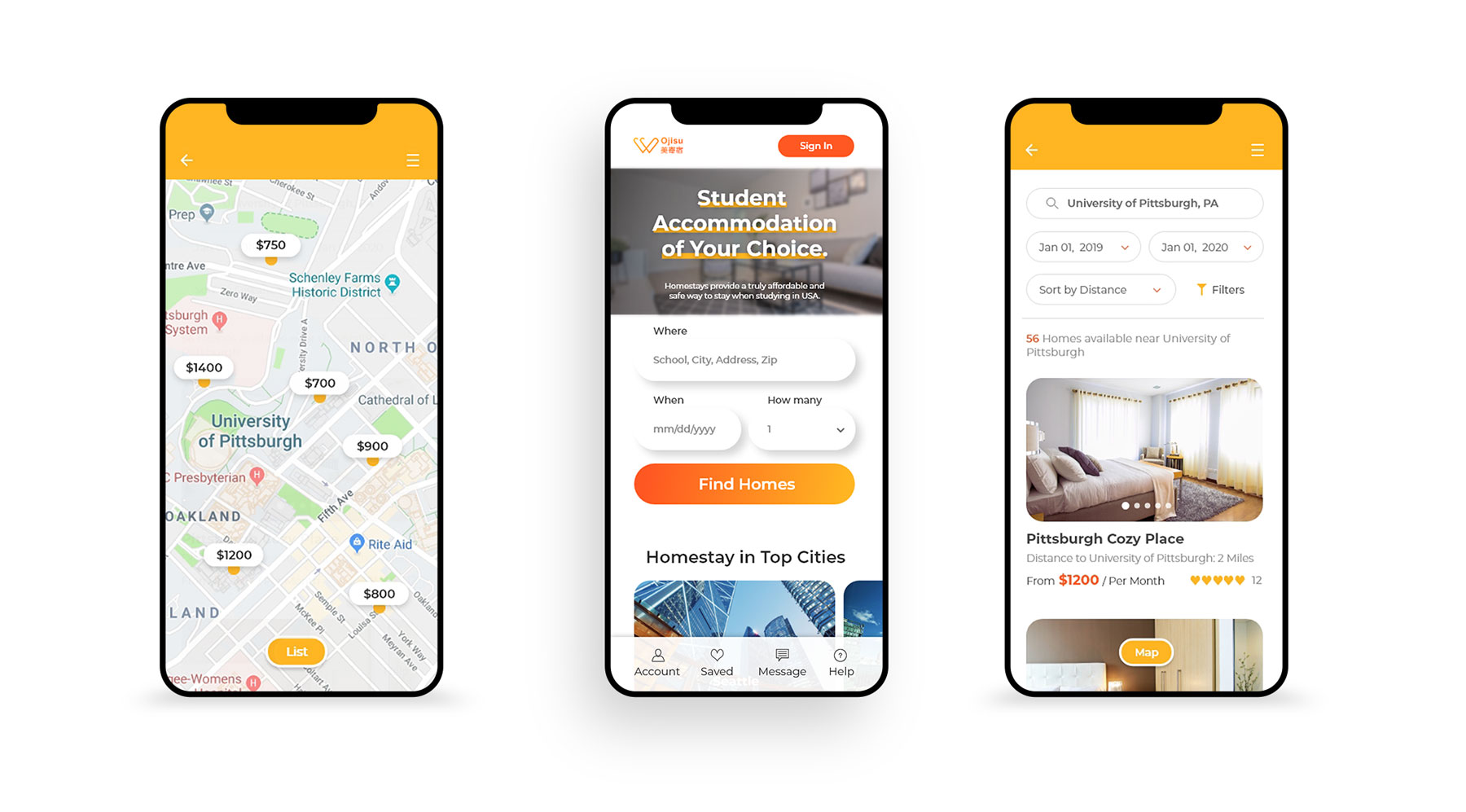
Also, a mobile site is designed seperately for Ojisu service. More mobile user interface is on the way...
To be continued...